
Design Ideas
Classic Cream Kitchen Ideas: Cabinets, Counters and Colors
How to design a classic cream kitchen: picking the right cream shade, cabinet styles, countertops, backsplash, hardware and accent colors.
By the Prime Construction team Updated October 13, 2026 6 min read
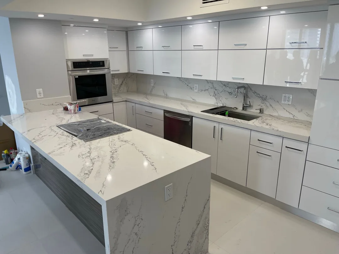
A classic cream kitchen uses warm off-white cabinets as the base of a timeless, soft look that sits between stark white and heavier neutrals. The key decisions are the cream shade (its undertone and how light it is), a simple cabinet door style, a countertop and backsplash that suit the undertone, and one or two accent materials such as wood, brass or a colored island. Get the undertones right and a cream kitchen looks warm and current for years.
Why cream works as a classic kitchen color
Cream is white with a little yellow, red or beige in it. That small amount of warmth is what makes it work:
- It is warmer than white. In rooms with wood floors, warm stone or afternoon sun, pure white can look cold or blue. Cream belongs.
- It is forgiving. Light smudges, dust and small wear marks show less on cream than on bright white.
- It works with many styles. Cream suits traditional raised panels, Shaker doors, farmhouse details and even flat-panel modern doors.
- It is easy to update. Changing hardware, lighting or a backsplash shifts the look without repainting the cabinets.
For a broader look at the timeless kitchen approach, see our classic kitchen guide.
Choosing the right cream shade
Two things decide whether a cream looks rich or muddy: its undertone and how much light it reflects.
Understand the undertone
- Yellow undertone. The most traditional cream. Beautiful with wood and brass, but it can look buttery in a room with strong warm light.
- Beige or greige undertone. A softer, more neutral cream that pairs easily with gray stone and stainless steel.
- Pink or red undertone. Warm and cozy, but it can read peach next to some tiles and woods. Test carefully.
- Green undertone. Subtle and earthy, and excellent with sage, olive and natural wood.
The quickest way to see the undertone is to hold the sample next to a sheet of plain white printer paper.
Check light reflectance
Paint makers list a light reflectance value (LRV) for each color on a scale of 0 to 100. Cabinet creams commonly sit in the 70s and 80s. Higher numbers look brighter and closer to white; lower numbers look more like a light beige. In a dim kitchen choose a higher LRV so the room does not feel heavy.
Test in your own light
Orlando light is strong. A cream that looks soft in a store can look yellow in a west-facing kitchen at 5 p.m. Paint a large sample board, at least 2 by 2 feet, and look at it in the morning, late afternoon and at night under your own bulbs before you commit.
Cabinet styles for a classic cream kitchen
The door style matters as much as the color.
- Shaker. The most common choice. A recessed flat center panel with a square frame is simple enough to stay current. Our Shaker cabinets guide covers sizes and construction.
- Inset doors. Doors sit flush inside the face frame for a furniture look. More expensive and they need precise installation, but nothing reads more classic.
- Raised panel. Traditional and formal. Works best in larger, more traditional homes.
- Beadboard or glass-front accents. Use on a few upper cabinets or the island to break up long runs.
A note on glaze: the brown glaze rubbed into corners that was popular years ago is the detail most likely to date a cream kitchen. If you want depth, use a two-tone scheme instead.
New cream cabinets, new doors on existing boxes, or painting is a question of budget and box condition. If your cabinet boxes are solid, cabinet refacing can give you cream doors and drawer fronts without replacing the whole kitchen.
Countertops for cream cabinets
The countertop sits right against the cabinets, so it has to share their warmth.
| Countertop | How it looks with cream | Notes |
|---|---|---|
| Warm white quartz | Clean and soft | Choose a warm white, not a blue-white |
| Marble-look quartz with soft veining | Classic with less upkeep | Gray or gold veining both work; match hardware |
| Honed marble | Very traditional | Etches and stains; needs sealing |
| Warm granite (beige, gold, brown tones) | Rich and traditional | Choose a calm pattern so it does not compete |
| Butcher block | Warm and casual | Great on an island; needs oiling |
| Soapstone or dark honed stone | Strong contrast | Use on the island or perimeter, not both |
For material options and installation, see our countertops service.
Backsplash ideas for a cream kitchen
- Cream or off-white subway tile. Choose a tile a touch lighter or darker than the cabinets so they do not look slightly mismatched.
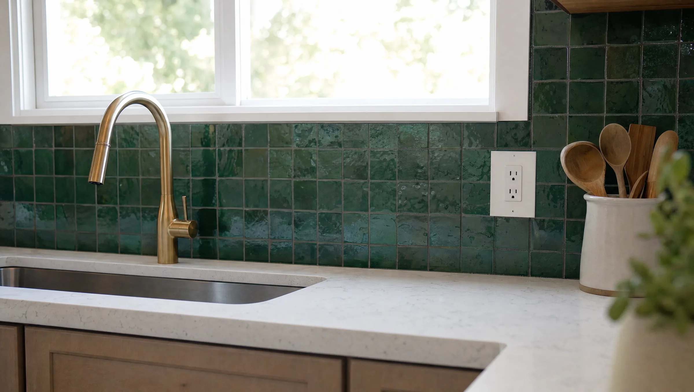
- Handmade-look or zellige-style tile. Uneven glazes add texture and depth in a mostly cream room.
- Marble or marble-look slab. Carry the countertop up the wall behind the range for a clean, high-end look.
- Soft color. Pale green, blue or terracotta tile gives a cream kitchen personality without a bold change.
Grout color matters. Warm white or light beige grout keeps the wall calm; dark grout makes the tile pattern the focus.
Accent colors and materials
A cream kitchen needs some contrast or it can look flat.
- Wood. A natural or stained wood island, open shelves or a range hood surround is the most classic pairing.
- Green. Sage, olive or deep forest green on the island or a lower run is a popular and lasting combination.
- Navy or deep blue. A blue island with cream perimeter cabinets is crisp and traditional.
- Black. Use for hardware, light fixtures or a window frame. A little goes a long way.
- Warm gray or taupe. A quieter two-tone option for people who want contrast without color.
Hardware, lighting and finishing touches
Hardware finishes
- Aged or unlacquered brass: warm and traditional; it darkens over time.
- Polished or satin nickel: soft and classic, a good match with gray-veined counters.
- Oil-rubbed bronze: traditional with good contrast.
- Matte black: a modern edge on a classic base.
Keep the faucet and hardware finish in the same family. See our kitchen cabinet hardware guide for sizes and placement.
Lighting
Cream can look muddy under the wrong bulbs. Use warm white LEDs (2700K to 3000K) with a good color rendering index (CRI 90 or higher) so the color reads true. Layer recessed or flush ceiling lights, under-cabinet LED strips and one or two decorative fixtures over the island or sink.
Flooring
Mid-tone wood or wood-look tile is the natural partner for cream. Light stone or porcelain also works if it shares the cream’s undertone. In Central Florida, many homeowners choose porcelain wood-look plank for its moisture resistance; our flooring service covers the options.
Common mistakes with cream kitchens
- Mixing creams. Cabinets, trim, tile and countertop in four slightly different creams look like mistakes. Pick one lead cream and use true white or a contrasting color elsewhere.
- Fighting the undertone. Cool gray stone next to yellow cream makes both look off.
- Too much of one color. An all-cream kitchen with cream counters, cream tile and cream floors needs wood, metal or a darker island for depth.
- Skipping samples. Always see the cabinet door, countertop sample and tile together in your kitchen’s light.
Keeping cream cabinets clean
Painted cream cabinets clean easily with mild dish soap and warm water on a soft cloth. Avoid abrasive pads and harsh cleaners, which dull the finish. Wipe around the handles and under the sink regularly, since grease and water are what wear a painted finish first. Keep a small jar of touch-up paint from the cabinet maker for chips.
Planning a cream kitchen in Orlando?
The right cream depends on your light, your floors and the stone you choose, which is why seeing samples together in your kitchen matters so much. Prime Construction measures your space, builds a 3D design rendering and helps you pick cabinets, counters and tile that work together before anything is ordered. If you are in the Orlando area, call (407) 404-3944 or request an estimate.